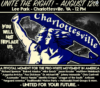
For the sake of posterity, here are four posters that were used to promote the Unite the Right march in Charlottesville, Virginia, on the weekend of August 12, 2017.
This one appears to have been distributed the most widely. It uses a red, white, and blue color scheme (USA! USA!), though it's clearly based on a Nazi style that would have used black instead of blue. The bottom one-fifth is all about Confederate symbolism, but the top 80 percent goes full Nazi.
The type choice is interesting: It's a stencil style, a bit similar to Stop, the font used in Star Trek the Next Generation. Kind of ’70s techno look, heavy and masculine.
The overall design gets points for its relative simplicity, using a symmetrical arrangement. The bottom is cluttered, however. The type hierarchy is a bit weak, though not terrible. The speaker names that are printed in black have fairly bad contrast against the red background.

This poster is a mess from a design perspective. Everything wants to be important, so nothing is important, and the blue/black color combination is very low-contrast. It uses four typefaces, including a delicate brush-lettering style called Sign Painter House Script to create a headline that's weak and wimpy. Not very virile, guys! Maybe this one was supposed to appeal to the chicks, eh? I wonder if that worked.
The heroic, Aryan couple (facing left in this right-wing layout, I note) is a flipped version of a Soviet couple from a 1961 poster for the USSR's space program (viewable here), originally done in red and yellow. It looked a lot better in the original, and the clueless arrangement of the name Charlottesville on the banner adds a final insult to the general ripoff.

This poster from the Daily Stormer is the most clearly antisemitic among the four, with a badly drawn muscleman smashing the Star of David. He's faceless so you can picture yourself in his place, I guess. It's got the black and red Nazi color scheme, too. The layout doesn't give a location or time for the gathering, so I wonder if people who saw this one made it there with their torches and weapons in time.

Identity Evropa (sic) is a recently formed white nationalist group that targets college campuses, and the design of the last poster reflects that. No Nazi iconography here — just a design that could be a movie poster, maybe something for the next Superman film.
Again, it uses a simple, symmetrical design, though it probably made a better social media graphic than an actual poster because it doesn't really pop off the page. It uses two sans serif fonts (very European), with notably bad kerning in the word YOU. And again, no time or place is given.
Monday, August 21, 2017
Posters for Posterity: Charlottesville 2017
Posted at
6:15 PM
![]()
![]()
Categories: Beyond Kitsch
Subscribe to:
Post Comments (Atom)


No comments:
Post a Comment